Saturday, October 31, 2015

Inktober images 2015


Above are the only drawings I was able to submit for this my first attempt at inktober 2015. I was a little bummed that I couldn't keep the momentum (had a flat move and new place had issues with internet), Maybe next year though. 
I thoroughly enjoyed the process, especially returning to traditional medium using mainly pro markers and some trusty ink pens. I also used twink (whiteout) pen for some highlights and fix ups. 
As always, thanks for visiting. Take care


Monday, September 28, 2015

Pandora comic - Influence map


As a part of Oatley Academy Live homework we had to create an influence map for our personal project (comic - Pandora).

This has been a great exercise. The main highlights from this so far are;

1. Developing the world in which the character lives in. This is broken down into 'whereabouts' and 'when'.

Whereabouts = Iowa, America. Why? The only real reason for my choosing this is my affinity for America when we travelled over there in 2012. Just loved it.

When = 1980's. Why? Being an 80's child has a somewhat bearing on this. However a major factor that I want to capture was an era in which technology was not so dominant. Hello 80's.
I feel this era will help my decision making within the story be more 'primal' and not so reliant on the hero been able to 'google' out of dangerous situations.

2. Influences and artists

For the influences and artists I've chosen barely touch the surface. Just so many awesome artists out there. However I do feel that Guy Davis, Mike Mignola and Carlos Huante really capture that essence that I am after. That huge creature by Guy Davis sprawling over the city - that for me is a key image. Just awesome.

Also under influences are colour scheme ideas and keys. Reference points for Celtic design and symbols.


Above screenshot image for study of 'entity' character for comic. Reference artists as above.

As always, thanks for visiting. Take care and hope to post more soon.

Pandora comic-story development

I have secretly been working away on my comic story for Pandora. Phew, what a process. Lots, and I mean lots to learn. So before I go any further I need to give a big shout out for these two great resources.

Firstly, Chris Oatley's Academy Live. The resources phenomenal, the people absolutely wonderful . Nothing beats not feeling alone out there in cyberspace. And secondly, Blake Synder's 'Save the cat'. This book 'Save the cat' is awesome. Find the website here.
Cannot recommend these resources more highly enough.

What follows below are screenshots of the processes I have been developing for my comic Pandora.

I have used Visio, a Microsoft flowchart / diagram program for mapping out the story structure. OMG, where have you been all my life Visio. If you need to have processes laid out visually with relative ease then check out this software. 


The logline (Blake Synder): Google 'logline' to find our more. However, in a nutshell it is the pitch to your story. Tremendously helpful when developing your story. So keep this close by...it keeps you on track.

Opening image (Blake Synder): A paragraph that represents the tone / struggle of the main character.


Set up (Blake Synder): A paragraph on the main character's world as it is before the main catalyst takes effect.

Theme stated (Blake Synder): This is the 'what is your story about'. It's message. Really important to keep this close by as well when developing your story.

Catalysts mapped out: By plotting the major catalysts it has helped to gauge how to arrive and move through scenes. We'll, that's the theory anyway. Has been really helpful.

Antagonist backstory: Exploring the story of the bad guys. Something I found super helpful was 'rules of engagement' for the baddies. Having this rule reminds me to be consistent as the story progresses.

Catalyst developed with dialogue: For the first catalyst within the story I am trying to get a feel for how it might go by way of dialogue. This has helped so far and I have continued to use for the other catalysts as well.

Disclaimer: All of the above is the result of the absolutely awesome cited resources above. Also, I cannot recommend more highly if you (yes you) are wanting to learn about crafting a story that you visit Oatley Academy Live.

As always, thanks for visiting. More to follow soon. 
Welcome any thoughts, comments. Have a great day.

Pandora comic test page


This was my first attempt with trialing different colour treatments for a potential comic page of Pandora. I had already decided that the colour scheme for this comic will be analogous. The first image at left is not great. But I had to do this in order to see what I didn't want.


These next images (the left is the same as the top right) - I adjusted the background transparency to see if this would create an interesting look. Still unsure at this stage. But I am certain that the one at left is stronger.
At this point too I have consciously left out any shadowing. The last image (next) I have introduced a basic shading. It is again the strongest of the other options so far.
I hope to soon upload some more tests. One thing I have also considered is texture. This can be as simple as adding linear marks.


As always thanks for visiting. Take care and hope to post up more soon.


Monday, September 14, 2015

Chosen as one of the top 3 students for character design challenge!!!

Absolutely stoked to be recognized as one of the top three students for this awesome course through Skillshare. It is a real honor. Super stoked.
And yes, a bit more meme and then that's it I promise, but here is the certificate for completing the course...YAY!!!

As always, thanks for visiting and if you want to find out more about Skillshare check it out here. Also if you want to see some of the art I created as the result of doing this course, please click here.

Monday, September 7, 2015

Mini Chewie

Chewbacca illustration
Final 30 day character illustration completed!!!! YAY and whoooaaa!!!!
As I had previously done this lesson some months earlier I was encouraged to re-submit or tweak the design from that lesson. So I went back to the future (oh yeah) to re-submit another Chewbacca.
It was a busy weekend so this concept (above) was quickly hashed out old school - on paper with pencil. Took photo on ipad and imported into Manga Studio 5. Also used Sketchup for a little help with the gun.

Thanks for visiting and take care

If you liked this post, you may also like the following;

Tuesday, August 25, 2015

From Concept to final artwork - finished piece

The final image. Hooray!!!
Did a very basic background that was setup in Illustrator. More texture was applied to the floor.
The speech-bubble was done in Manga studio 5. Manga has such a flexible, intuitive setup for doing speech bubbles. Way more so than Photoshop or Illustrator.

Thanks as always for visiting. 
Last lesson for 30 day challenge by the super talented Patrick Brown to follow soon.

Monday, August 24, 2015

From Concept to final artwork - colour tests

From the previous post (see here) - I now have coloured up the above image in Photoshop. Also have added some yummy textures. There is certainly a lot more to this piece which can only really be covered by checking out the tutorial by Matt Kaufenberg here. Awesome, seriously check it out.

For these next examples below I colour corrected (played around) with the colours to find a pleasing colour scheme. This was done in Photoshop using Hue-Saturation.


How's about some gradient
This was a new technique that I stumbled upon. I had selected the outline of the boxer character and filled it in with a flat colour on a new layer. In this case it was yellow. Then I selected the filled shape and did a gradient with a purple colour. Also on a new layer. The gradient was set foreground to transparent. From there I played around with the mode settings for each of the respective coloured layers to get the above look. Overall I was stoked with the outcome. Super bonus.

Thanks for visiting and take care. Will post up image with background soon.

Friday, August 21, 2015

From Concept to Final Artwork

Next 30 day character challenge (Lesson 2). Create a character and complete to Final Artwork by the amazing Matt Kaufenberg through Skillshare. Course found here.

The above characters were just quick roughs to flesh out a character to push through to final design. So I went with the bottom character (mr big nose), a.k.a  boxer.
I referred to Matt's style to hopefully capture elements from his artwork and infuse into the character design.

Once you had a character idea, it was into Illustrator to get the shapes of the character which were then saved out as paths and exported into Photoshop. This wasn't a process I was familiar with but have found it has some real advantageous. I really must one day put up a little tutorial regarding this process.

Well, thanks for visiting. Next post coming up soon.


Monday, August 17, 2015

Building character with basic shapes final

Finally finished up 'Diva Karate Pirate'.
This course through online 'Skillshare' was brilliant. Challenging and very concise thanks to Brian Shepard the tutor. Check out the course here

Two great lessons
The first lesson for me was learning the importance of silhouette. And secondly was developing a character based on keywords that guided you towards a finished idea. 

As always, thanks for looking. 

If you liked this post, you may also like the following:

Saturday, August 15, 2015

Build character with basic shapes and silhouette

Building on from the previous post here. The 'Diva, Karate Pirate' was starting to take some more shape. First thing for the chopping board was his initial hairstyle (top left). I felt that it didn't read well as a silhouette. After some investigation online I found the perfect solution. My little pony. Yes. Those gorgeous curls. So he got the 'DIVA' curls.

Silhouette
If there is one thing that I cannot stress enough. Is good silhouette. I think I have managed to design a pleasing read for this character. The funny thing is I have heard this term plenty been voiced online regarding character design. I now understand why. Must have good silhouette.

Final design next post. 

Thanks for visiting.

If you liked this post, you may also like the following;

Build character with basic shapes continued

Building on from the previous post here. My hero character was based on the primitive shape of the circle. As a part of the course you had to come up with 3 keywords to build upon the character.
I chose 'Diva, Karate and Pirate'. Bit of a crazy combo. 

So I went online and google image searched under these keywords. Came up with some great creative startups.

Still a nice guy
The main focus going forward was the general 'feel' of the character. So emphasis was placed on that he was a 'happy, approachable fellah'. I felt with the top 4 heads with no pupils made them a little scary. So adding the pupils made him nice again (YAY). 

Next post I will show some developments of the basic body shapes and silhouette exploration.

As always, thanks and take care.

Build character with basic shapes

Hello everyone. 
Just started another great course through 'Skillshare'. Called 'Build a fantasy character with a shape language' by Brian Shepard. So recommend it.

Skillshare is an online education portal that offers many courses which you have access to by paying a monthly subscription fee. Well worth it. Find it here Skillshare
I had only recently finished up a course there by Patrick Brown (amazing artist). Find my finished art piece here (star wars fan art).

Pareidolia
Pareidolia what? Yes, thats what I thought at first glance too. Actually I had to wiki it to get my head around it. Very cool concept. Basically you as an artist take very basic primitive shapes like the square, circle or triangle and arrange it in such a way that you can create a pattern. That pattern may hopefully look like a face. Look at that wall plug socket in your home. Kinda looks like a face aye?

Circle equals nice guy and triangle, the antagonist
All rules are made to be messed up somewhat. But a general rule is that a character that is more generous in the round department is going to be nice. Jolly and worth a hug or too. The angular. Well they are something again. Little edgy (hehe) and more dangerous.
I experimented with these concepts (as above image) to develop some basic ideas. I worked within Illustrator CS3 which lends well to manipulating and arranging shapes into pleasing compositions.

Next post will be some more developments of a chosen character with three 'keywords' to help create the personality.

Take care and thanks for visiting.

If you liked this post, you may also like the following;

Tools used
  • CS3 Illustrator

Monday, August 10, 2015

Pandora character with background

Have tried a new technique. Not so many outlines (dark that is) for the background and main character. Am really happy with the result as it feels softer.

Colour schemes
Only in the last day or too I have been studying up on different colour schemes. One such colour scheme that is in the above image is called 'Analogous'. This wasn't intentional either when I did this background. So it was very interesting for me to discover that I am naturally doing this. Kinda cool I reckon.
Definition of a 'Analogous' colour scheme as follows; '..are colours that sit on the Colour Wheel and have a common hue'. Example for above image is the dinosaur (mr bluey) in which he has 1-3 contrasts of that blue hue.

Helpful link for colour schemes
I would thoroughly recommend to check out this artist (on Deviant art) and there helpful tips regarding colour schemes.

As a side note, I have really enjoyed pushing the character design further by way of a background. It just gives so much more context of story for the character. 

Take care and thanks for visiting. 

If you liked this post, you may also like the following;

Tools used
  • CS3 photoshop and illustrator
  • Wacom intuos 5
  • Reference for visual style (Brittney Lee) 

Friday, August 7, 2015

Pandora comic - model turn-around sheets: Front and side profiles


I firstly have to acknowledge this fine artist Luis Escobar for his comments on the power of the turn around model sheet for character design. Check out page here for his take on it too.

The above character 'Panda' short for Pandora is one of the protagonist's for my comic I am slowly developing.  So I just knew that I would have to get a model sheet underway to help. As Luis has said on his web page, having a turnaround takes out the guess work for every time you are to draw a character. Already I have found this to be very efficient when drawing the character.

The 'rig' like skeleton I created has also helped to quickly nail proportions and poses. Artist Andrew Loomis in 'Figure drawing for all it's worth' which I highly recommend to check out used this technique of a mannequin understructure to set up a character.

And finally there is an awesome iPad app called 'Skelly' which you pay a few bucks for. It has a fantastic feature to set up a quick pose by articulating the major joints on a skeleton structure. Not only that but you can also pan, zoom and move the view around to nail some awesome shots for a potential character pose. Below is an example of one such shot. Think of the time that saves you...AWESOME!!! Also, yes there is more. Been able to see the bones in the app helps so much when trying to work out location for muscles. Get this app!!
As always thanks for visiting. Take care

Links as follows; 
Andrew Loomis online 'Figure drawing for all it's worth' (This takes you to download of PDF)

Friday, July 31, 2015

Comic character concept - Pandora 14 years old

This has been a great exercise to develop the character further and to see her as a young teenager of 14. I do hope to put up soon a very basic 4-5 sentence #'logline' of the story. 
The basic idea for now is that Pandora (Panda) is able to enter into her dreams which happen to be 'of other worlds'. One of those worlds happens to be with dinosaurs. Kinda cool I reckon!!!
The one thing I have found to be great about this exercise is 'connecting' more with the character. There are certainly more questions than answers. But I find that I'm more excited to be trying to realize and pursue the character and the story they inhibit.

# Logline; Whaaaat? 
A logline is a one (or occasionally two) sentence description that boils the script down to its essential dramatic narrative in as succinct a manner as possible.
A tagline is a piece of marketing copy designed to go on posters to sell the film
- In space no one can hear you scream (Alien)
10 Tips for Writing loglines 

As always thanks for visiting. Take care

Tools used:
  • Photoshop CS3
  • Wacom Intuos 5

Monday, July 27, 2015

Comic character concept - Pandora

Pandora comic concepts
Super excited. Super nervous. This is my first of hopefully many more concepts for a comic story that I am slowly developing. The story is very much in 'development' stage as are the concepts above for one main character. More characters to come overtime.
The character's name above is 'Panda', short for Pandora. 
If I haven't already said, I am currently enrolled with Oatley Academy Live. The curriculum so far is developing a 'personal project'. My hope is that one day the content I produce will be completed for a web comic and a physical hard-copy comic book. Funded through Kickstarter or Patreon.
As always, thanks for visiting. And if you (yes, you) have ever wanted to find inspiration, clear and thought challenging direction for your art. Check out Oatley Academy Live. You will not regret it.
Take care

Saturday, July 25, 2015

Wellington, New Zealand 2015 visit


Had a fantastic time in Wellington with my wife for her birthday. We got to see some amazing stuff like the 'The State of our war'. New Zealand's war efforts over in Gallipoli. The statue models were huge as you can see by scale of my wife standing next to one. Weta Workshop had created the models as they have for all they other images above. Seriously talented people. If you have a chance to be in Wellington, New Zealand - definitely check out Te Papa for the 'The State of our war' and "Weta Cave' and the Wellington Airport for  Gandalf, Gollum and Smaug. All free too. Which is AWESOME!!!!

Tuesday, July 21, 2015

Sonya Crawford 2015

Sonya Crawford 2015 birthday
To the most amazing woman that I know, my beautiful wife. She has been my greatest support and loving ear when I have been a nut job in my pursuit of art.
Love you babe. Thanks for being you.

"Like a lily among the thorns, So is my darling among the maidens." Bible

Sunday, July 19, 2015

Manga studio 5 girl image

Manga Studio 5 image from Jason Crawford Art
Recently bought Manga Studio 5 or as it is known (Clip Studio Paint Pro digital). Wow, what an amazing program.
The features so far are really intuitive to use. Especially the brushes. They are so smooth and the responsiveness with the wacom tablet is in my opinion far superior to photoshop. 
In the past where I would have to do my inking on the ipad and then colour up in photoshop, I can now do all within the one program. Absolute time saver!!!!

Probably however the biggest selling point for the program is the cost price. I paid just over $30 (NZ dollars). This was with a sale that Manga had on recently. But I would be more than happy to pay the full price of $75. Also to note that upgrading is very affordable for the future. So well done Manga Studio.

So, in closing...couldn't recommend this program more highly enough. Can't wait to upload more yummies in the future from this program.

A question for you, yes you (the visitor).
If you have used Manga Studio I would love to hear any comments on how you have found the program. As always, thanks for visiting.

Take care

Tools used = Manga Studio (only)

Tuesday, June 23, 2015

Jack Frost illustration

Mr Jack Frost illustration
We have had such a good winter so far. Until today (boo). Mr Jack Frost decided to pay a visit. It was so so cold. 
This illustration was a quick digital doodle (say that fast a few times). I tried some different photoshop brushes. They are more traditional and the overall feel is a lot looser.
Over the next few months I am hoping to try my hand at some differing styles to my more crisp outline style. 
We'll, better head to bed (warm thoughts, warm thoughts) as Mr Frost is coming again tonight.

Take care everyone
Thanks for visiting

Tools used:
  • Wacom Intuos 5
  • Photoshop CS3
  • woolen beanie for my head

Sunday, June 14, 2015

Jurassic Kid illustration

Just had to do an illustration with the up and coming new Jurassic World movie. I initially wanted to go with a fan art image but I was thinking, nah. Let's go to a more emotional place. Like how I felt when I saw the very first movie. Now I definitely was not that young (above image), but watching the first movie made me feel that way. As did the remaining movies.
The fourth movie doesn't quite have the magic of the first but it still has plenty of action and enough dinosaur carnage to keep anyone well entertained. 

As always take care, thanks for visiting.

Tools used:
  • Illustrator CS3 for the crispy clean lines
  • Photoshop CS3 for the rendering

Monday, June 8, 2015

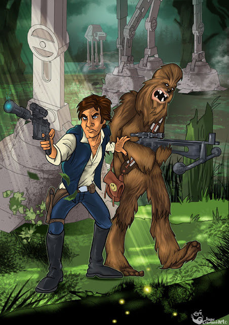
Star Wars fan art illustration

Star Wars fan art
It is finished - whoooaaa!!!!This has been a labor of love and hate as I have worked on this for the last month and a half. So glad I persevered. Probably the greatest lesson I have learned is if something is bothering you, get rid of it. That walking carpet (Mr Chewbacca) was edited and re-edited sooooo many times till I got the fur where I wanted it. Full respect to artists who do furry creatures. Seriously!!!
I will post up soon a basic little run over of the basics in this piece. Hope some stuff in it may help.
As always, thanks for visiting.
And a big shout out to the awesome artist Patrick Brown. His tutorial online through Skillshare was awesome and helped me so much. Thank you Patrick.

Tools used:
  • Photoshop CS3
  • Wacom tablet
  • Sketch up for AT-AT Walkers
  • Illustrator CS3
  • a mumbling plea of "this wookie will not get the better of me"

Saturday, May 30, 2015

What if your pet had super powers?

Dog vs cat illustration for #creativeprompt

My third entry into #creativeprompt challenge from Henrike Dijkstra.

Today’s challenge was to come up with an idea regarding what if your pet or someone you knew had gained a super power?

Thought of the ongoing power struggle between pets, specifically dog vs cat. Hey, I am a dog lover myself so went with dog having a super power and using it to get one over the cat. Seen way to many Youtube videos of cat's been so nasty. So here's to all you dog lovers out there.

Tools used:
  • Adobe ideas
  • Procreate
  • Photoshop CS3 for quick tidy up